Case Study: Crowdfunding Lessons From Minaal

“That bag is your girlfriend.”

That’s what the Vietnamese waitress told Jimmy and Doug as she brought them their meal.

It wasn’t the first time she’d seen the prototype bag propped up in its own chair as my friends enjoyed their beers.

The bag had its own chair, because Doug and Jimmy were on a mission for even more feedback. They would proactively show it to travelers and locals and anyone who would stop to ask them what they thought.

MinnalBag_615

It’s that obsession over product quality and listening to feedback from other travelers that has helped Jimmy and Doug raise over $1 million through two wildly popular Kickstarter campaigns.

  • Two regular guys from New Zealand.
  • Two Kickstarter campaigns (just over two years apart).
  • Two products.
  • One new travel brand.
  • Over a million dollars raised.

In this video interview, Jimmy and Doug reveal how they turned their idea into Minaal, a popular bag company and how they’re turning Minaal from “just” a bag company into a true lifestyle and travel brand.

Before you watch the video, check out Minaal’s amazing second Kickstarter campaign.

It’s ending soon, and it’s your only chance to buy any of their products lower than full price. Even if you don’t need a travel bag, the 24-second intro to their campaign video is priceless.

In the video above, Jimmy and Doug of Minaal share their crowdfunding lessons…

  1. How they initially met and started Minaal and how it’s evolving from just a bag company to a true lifestyle brand
  2. How a road-trip adventure across the U.S. in a used van and sleeping in Walmart parking lots inspired the creation of Minaal
  3. Why the “lightbulb moment” for Minaal wasn’t a single moment, but actually years of frustration
  4. Why as entrepreneurs, we should be thankful for bad products
  5. How Jimmy and Doug discovered Kickstarter and decided to use crowdfunding to launch Minaal in 2013
  6. How two non-product designers (Jimmy says he could only draw stick figures) designed a functional prototype in a few short months
  7. You can hire out design, but you can’t hire out someone willing to care deeply about the product quality and usability
  8. Why Minaal was never a “hobby” and was designed as a serious, money-making project from day one
  9. How Jimmy and Doug see the future vision of Minaal and how they structured the business to achieve their personal entrepreneurial goals (and what’s next)
  10. How the passionate tribe they’ve built keep Doug and Jimmy going and the role that tribe played in the evolution of the product, the growth of the business and both Kickstarter campaigns
  11. How Jimmy and Doug found their future customers and then relentlessly ask questions and proactively listen to feedback
  12. The importance of having a working prototype and using it to gather in-person feedback
  13. How they prepared for the first campaign, including how they set their initial funding goal, including minimum order quantities, shipping costs and how much they would be willing to “top off” the campaign if they were short
  14. The critical importance of “scenario planning”, meaning running many different backer scenarios (both good and bad) before you launch
  15. Why most crowdfunding projects get fulfilled late (and how Minaal planned and prepared to deliver on-time)
  16. How Minaal structured their pre-launch marketing, including teasing images of the bag on social media
  17. How they overcame not having a large email list before launching their first campaign (only ~500-1000)
  18. The importance of focusing on a super specific customer avatar and laser-focus on your specific niche instead of aiming for mass appeal
  19. How building loads of personal relationships and being part of a community was more important to Minaal’s success than building a large email list
  20. The importance of a fast start for a Kickstarter campaign and how it can “snowball”
  21. How Minaal ignored the naysayers and ran a crowdfunding campaign with minimal frustration and angst
  22. The importance of frequent communication and updates, and why you should tell your backers exactly when you’ll post your next updates
  23. How Minaal’s first Kickstarter campaign solidified the creation of their passionate tribe
  24. How that tribe informed the product design process
  25. Why they weren’t sure their first campaign would work and how increased expectations made them just as nervous for their second campaign
  26. How they designed the video of their second campaign, balancing entertainment and humor while still highlighting their tribe and their product
  27. How they made a longer video (4:03) but kept it interesting, using each segment of the video to setup the next segment
  28. Why they focused on less press outreach and more on email marketing for their second campaign
  29. How they offered the best early-bird pricing to their existing audience, and offered a special launch notification only to newsletter subscribers
  30. Why traffic from niche publications (“cash press”) converts to backers much higher than big-name publications (“flash press”)
  31. Why they never discounts their products, except for pre-selling when they launch new units on Kickstarter
  32. The importance of finding your community, becoming a part of their story and making them a part of your story
  33. Why a crowdfunding campaign feels like a 400 meter sprint, but the finish line is really just the beginning
  34. Doug’s final tip: “Ask lots of questions and ask them as early as possible. Know that things can take a really long time. If you need to pause your campaign to get everything buttoned up, pause it. Don’t launch too soon.”
  35. Jimmy’s final tip: “Remove your ego from your design feedback process. Don’t lead people with what you think…ask them what they think. Don’t explain away their feedback. Sponge up every single bit and process it later.”
Did you enjoy the interview? Let me know in the comments below.
Zuddah Coconut Oil

Crowdfunding lessons from a six-time creator

Many creators are still planning and considering how to launch their first campaign.

Some already have one under their belt. Ambitious creators have done two campaigns.

Tyson Adams just launched his sixth. This time, for Zuddah Coconut Oil, his latest venture.

Because Tyson has done this before, his campaign is already 50% funded in just a few days.

I’ve known Tyson for years and we’ve collaborated on multiple projects, so this time, we thought it would be fun to bring you behind the scenes of a successful crowdfunding campaign.

So each week of his campaign, I’m going to interview Tyson live and we’re going to pull back the curtain and teach you the exact crowdfunding lessons you can use for your own campaign.

We just recorded the first of four interviews.

In Part 1 of 4, Tyson and I chat about:

• How Tyson started crowdfunding (1:50)
• How to craft quality, high-value rewards (3:02)
• How to make your brand sticky via crowdfunding (4:20)
• How Tyson fell in love with coconut oil (and then became a expert) (5:40)
• How to validate or invalidate other people’s advice (11:00)
• Why Tyson chose crowdfunding for a product he’s going to sell on Amazon (17:00)
• Tyson’s unique pre-launch marketing and branding plan (18:25)
• How Tyson chose the design and branding for Zuddah’s packaging (20:30)
• The importance of a specific customer avatar (22:00)
• How Tyson developed, planned and created his Zuddah Indiegogo campaign video (23:50)
• How to grab the viewer’s attention with your video (25:00)
• A great example of a crowdfunding video you can learn from (and mimic for your own campaign) (26:05)
• The importance of pricing your reward levels “below MSRP” (27:20)
• Why you need an impactful campaign headline that can stand on its own (28:45)
• One of the most common crowdfunding mistakes (and how to avoid it) (29:15)
• One part of your crowdfunding campaign page that you can edit after you go live (31:15)
• Why your campaign needs a “no-brainer” reward level (32:15)

You can watch the video below. If you can’t see the video, click here.

I’ll be talking more about Tyson’s campaign and answering your crowdfunding questions live at my next crowdfunding mini-course. The online mini-course is free and it’s live but seats are limited, so signup today.

Crowdfunding Project Teardown: Next Keyboard for iPhone on Kickstarter

A lot of you have been emailing me asking for more crowdfunding videos and screencasts, so…

I put together this 4-video screencast teardown of Next Keyboard – The Perfect Keyboard for iPhone, a live, recently launched Kickstarter project.

(Note: I traded a few emails with the team before they launched, so I gave them advice on a few pieces of this, but I wasn’t deeply involved in the planning or execution.)

There are 4 video screencasts total, and in each, I analyze a different piece of the campaign:

In the first video screencast, I discuss their project title, their funding goal and their unique choice of project duration.

Crowdfunding Video Teardown – The Next Keyboard – 1 of 4 – Title, Funding Goal and Duration


In the second video, I review their crowdfunding video, bit by bit. If you’ve ever wondered what to include in your crowdfunding video, this one is for you.

Crowdfunding Video Teardown – The Next Keyboard – 2 of 4 – The Video


In the third video, I analyze their rewards and pricing and the value at each level. They did something really clever with the $1 level.

Crowdfunding Video Teardown – The Next Keyboard – 3 of 4 – Reward Levels and Pricing


In the fourth and final video, I review the main body section of the campaign (the part below the video). The Next Keyboard team also did something really smart here that you can steal for your own campaigns. In this last video, I also cover a two small tweaks I’d suggest to the team to help increase conversions.

Crowdfunding Video Teardown – The Next Keyboard – 4 of 4 – Campaign Body

What do you think? Did you like this? What else do you want to see?

Let me know in the comments below (or with a social share).

If you find them valuable, I’ll do them more often.

Thanks!

How to crowdfund an app

How to crowdfund an app

In this post, I’m going to teach you:

  • how to crowdfund an app
  • why crowdfunding an app is different than crowdfunding other projects
  • which reward level you should offer your app at
  • how you should price your app
  • the two key attributes of great reward levels
  • how to increase your average contribution per backer

Why crowdfunding an app is different

Crowdfunding an app is different than crowdfunding other products for two main reasons.

  1. Consumers ALREADY expect apps to be cheap. People expect mobile apps to be either free or only cost a few dollars. For desktop apps (say, in the Mac App Store), the range is slightly higher, from free to  $5-$20. And that’s the “full retail price” in the app store.
  2. You need to price your app EVEN CHEAPER when crowdfunding – When crowdfunding an app, you should charge less than the full price it will eventually cost in the app store or on your website to compensate the backers for the fulfillment risk they’re taking on. I call this pricing “below MSRP”.

Here’s why you need to price your app “below MSRP”:

  • Your app is unproven. You haven’t launched yet. You haven’t scaled. There will be issues and bugs.
  • They have to wait. Your app isn’t ready immediately. When people buy apps in the app store, they can download them instantly. You’re asking them to wait until you ship the app.
  • It may never come AT ALL. Building apps is hard. Estimating development timelines is hard. The platforms (Kickstarter and Indiegogo) try to make sure that the creators can deliver but lots of apps never even finish and ship before they run out of funds. Of course, this won’t apply to your app, but it still contributes to overall fulfillment risk.

When people buy an app in an app store, they’re paying for a finished app, that has met certain app store requirements. It likely has lots of user reviews and will be delivered instantly.

When crowdfunding, you’re asking people you don’t know, for cash, ahead of time, to take a chance on your team’s ability to build and deliver the app you describe, on-time and on-budget.

For this, your early backers deserve a discount.

I suggest 50% off of full MSRP / app store price as a good rule of thumb. As you’ll see in the examples below, 50% off worked well.

Also, this means that the app itself should be the first and lowest priced reward level.

Unfortunately, this causes a problem

Pricing your app 50% cheaper than what you’ll sell it for once it’s available in the app store presents a problem.

The per-unit price is so low (half of a small number is a really small number), that even with a modest funding goal the math doesn’t work.

Let’s look at a simple example.

Let’s say you wanted to raise $20,000 (a solid but reasonable funding goal) for an app that will cost $2 in the app store, so you offer it at 50% off on your Kickstarter campaign.

At a $1 price point, you would need 20,000 backers. Most projects don’t get anywhere near 20,000 backers…

Fortunately, there is a simple solution to this problem…

You need to increase your average contribution per backer.

To do that, you need to offer more valuable perks above and beyond the app itself.

This is the point where most creators get stuck.

Since the app itself is “the thing being created” and it’s being offered at the lowest price point (which it should), most entrepreneurs struggle to think of what else to offer at a higher price point.

But that’s the key to crowdfunding an app.

You need to brainstorm and create other relevant and valuable perks, package them with the app at higher reward levels, and keep each reward level “below MSRP”.

Let’s look at two specific example campaigns and how they did exactly that.

Case Study: Gmail for Mac, by Zive (desktop app example)

GmailForMac_Zive

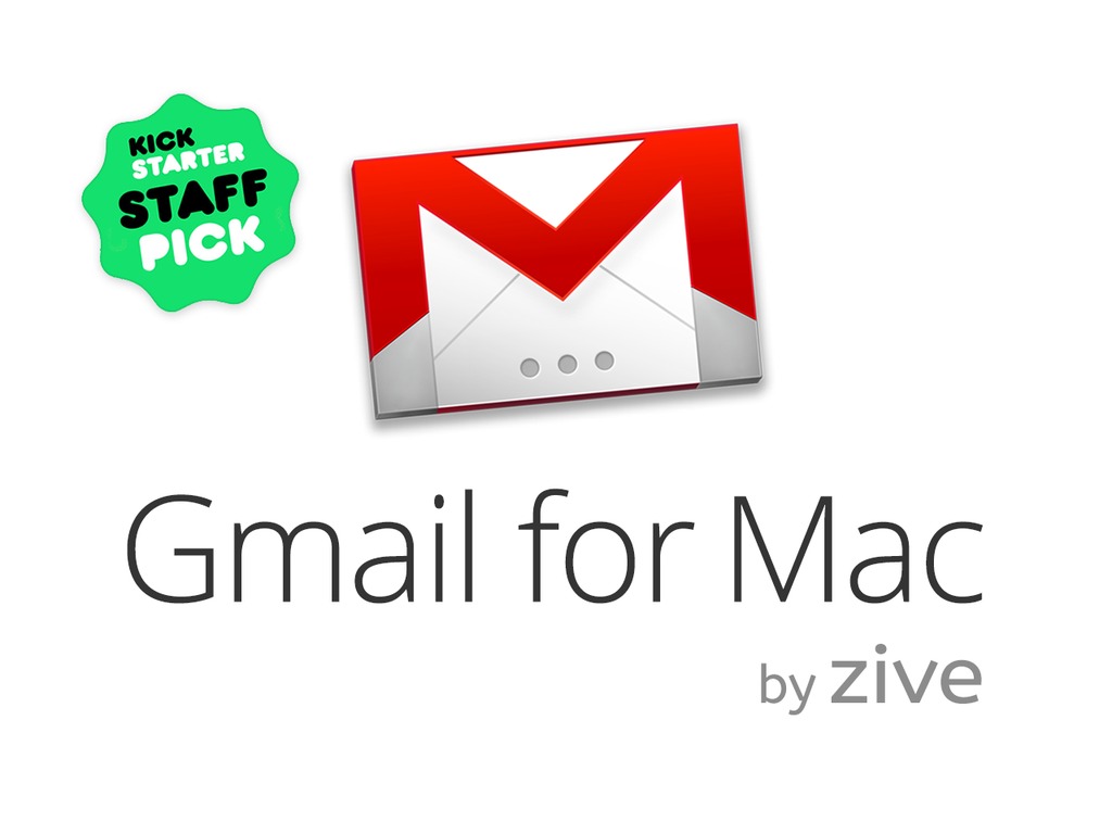
Gmail for Mac is a campaign from Zive, a startup that I’m advising. They are developing a desktop client for Gmail. Over 400 million people use Gmail but most use it in a browser tab. Eric Shashoua and his team wanted to build a desktop app that was fast and lightweight yet retained all of the useful features of Gmail (power search, plugins and extensions, etc.).

Their Kickstarter funding goal is $20,000.

The app will cost $9.99 full price (MSRP) when it’s for sale in the app store.

So (for the reasons described above) we offered it to Kickstarter backers at $4.99, a 50% discount.

To hit $20,000 at $5 a pop, they would need 4,000 backers, which is a LOT of backers, even with a strong marketing plan.

So we brainstormed other reward levels that we could offer at higher price points and then bundle them with the app.

Here’s what we came up with. We ended up with 11 total levels including the lowest and cheapest level, which is the app itself.

(This isn’t about finding “tricks” to get higher pledges from people. Zive put a lot of effort into creating levels of real value to the backers, things they could get excited about.)

  1. $5 – EARLY BIRD GMAIL FOR MAC: Get a full copy of Gmail for Mac, as soon as we launch in the app store! (50% off of retail price!)
  2. $9 level – PLUS, GMAIL POWER SEARCH VIDEO COURSE: Learn How to Search Gmail to Find Anything in Under 10 Seconds – and get the most out of Gmail for Mac’s powerful email search.
  3. $14 level – PLUS, 15 TOP EMAIL TEMPLATES FOR GMAIL + THE PERFECT GMAIL SIGNATURE VIDEO COURSE: Get the most out of Gmail for Mac – Executive secrets to writing quick responses and mastering your email communication, tailored for Gmail.
  4. $21 – PLUS, THE GMAIL NINJA COURSE: The top 10 Gmail features you should use, but you don’t. Perfect guide to harness the unique power of Gmail for Mac over typical email clients.
  5. $28 – THE NO-BRAINER LEVEL + EARLY ACCESS TO NEW FEATURES: Everything and the kitchen sink. You get ALL of the Gmail bonus video courses PLUS the full copy of Gmail for Mac as soon as we launch in the app store, PLUS early priority access to new features to support popular Gmail plugins & add-ons like Rapportive and Boomerang. Early access means you’ll get priority access to these special features before they come out.
  6. $40 – THE SIX PACK: Everything above, plus five more licenses to give to your best friends and family. Holiday shopping? Done!
  7. $80 – THE TEN PACK: Everything from the NO BRAINER level, plus NINE more licenses. Give them to friends and family, your startup team or your favorite officemates. Holiday shopping done in November? Done!!
  8. $100 – PLUS, EARLY ACCESS TO GMAIL FOR MAC + ALPHA INSIDER TEAM: Want to get your hands on Gmail for Mac now? Get early access to the app very soon, before it even launches, and become an optional part of our alpha product insider team.
  9. $150 – PLUS, ONE HOUR STRATEGY CALL WITH FOUNDERS – All of the above, plus a video call with the Gmail for Mac founders; the CEO and CTO. Ask us about raising venture capital, selling a company while still in your 20s, getting featured in the Apple Store, a burning passion for software design — or anything else!
  10. $300 – PLUS PERSONAL GUIDED SETUP WITH FOUNDERS – We’ll help you personally setup and optimize Gmail for Mac, including full setup of the app, optimizing your settings, labs, contacts, and accounts, and helping you build your perfect email signature. Let the experts help you master Gmail, once and for all.
  11. $1,000 – THE STARTUP MASTERCLASS – Bring your whole team. The Zive team will meet with you or your team for one hour a month for 6 months, helping your startup think through marketing, growth, fundraising, product design, and development. We’d love to help you do awesomely with your startup!

Each additional perk met the two key attributes of all good reward levels:

  1. Is it relevant to the project?
  2. Is it valuable to the backer and priced “below MSRP”?

Did it work?

Absolutely. The campaign just passed $30,000 with 3 days to go.

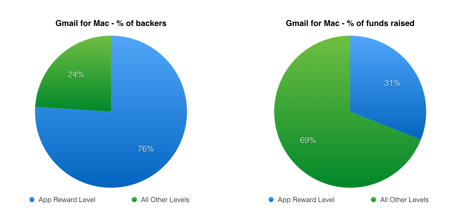
Here is a breakdown* of Gmail for Mac’s backers by reward level and the percentage (%) of backers that each level represents.

  1. $5 – 1866 backers – 76% of backers (As designed, the lowest level, the app itself, offered at a 50% discount, had 76% of the backers, the most by far)
  2. $9 – 77 backers – 3%
  3. $14 – 56 backers – 2%
  4. $21 – 56 backers – 2%
  5. $28 – 210 backers – 9% (notice that this “no-brainer” level easily has the second most backers)
  6. $40 – 120 backers – 5%
  7. $80 – 10 backers – Less than 1%
  8. $100 – 33 backers – 1%
  9. $150 – 3 backers – Less than 1%
  10. $300 – 4 backers – Less than 1%
  11. $1000 – 1 backer – Less than 1%

And here is that same revenue breakdown* by reward level and the percentage (%) of total funds raised.

  1. $5 – $9,374 – 31% of funds raised
  2. $9 – $700 – 2% of funds raised
  3. $14 – $787 – 3%
  4. $21 – $1,180 – 4%
  5. $28 – $5,894 – 19% (again, the “no-brainer” level has the second highest % of funds raised)
  6. $40 – $4,84 0 – 16%
  7. $80 – $800 – 3%
  8. $100 – $3,300 – 11%
  9. $150 – $450 – 1%
  10. $300 – $1,200 – 4%
  11. $1000 – $1,500 – 5%


GmailForMac_Graph


* This breakdown was done with 3 days left, so these numbers will change slightly by the end of the campaign.

Analysis and takeaways from Gmail for Mac:

  • Notice that just the app level itself, even with all the backers (76% of the total backers), would NOT have been enough to even hit 50% of Zive’s $20,000 funding goal ($9,374 of $20,000).
  • The use of a “no-brainer” level (the ‘extra value meal’ of crowdfunding) resulted in the second most backers and % of funds raised)
  • The lesson is clear. You need to offer other relevant and valuable perks at higher reward levels than the app itself.

Let’s look at one more example, this time using a mobile app.

Case Study: TripSaver from Matt Kepnes (mobile app example)

TripSaver

Matt Kepnes is a good friend, a top travel blogger and the author of How to Travel the World on $50 a Day. Because Matt is a travel budget expert, one question he repeatedly got from his tribe was how much to budget when traveling to different parts of the world. As his readership grew, responding to everyone individually became unsustainable so Matt decided to build an app that would serve as a travel cost and budgeting calculator.

He called this app Trip Saver: The Ultimate Travel Budgeting App. You can view his successful Kickstarter campaign here and we’ll break it down below.

Matt wasn’t trying to make a bunch of money from his campaign, he just wanted to cover the cost of iOS and Android development so he could build the app for his tribe that was clamoring for it.

For development of the app on iOS and Android, Matt and his team needed $8,000, so that’s what he set his Kickstarter funding goal at.

Since it’s a mobile app, he decided that full price (MSRP) when it was available in the app store would be $1.99.

So (again, for the reasons described above) Matt offered it to Kickstarter backers at $1, a 50% discount.

Even with a very modest funding goal of $8,000, at $1 a pop, Matt would need 8,000 backers to hit his goal. Even though Matt had an active and passionate tribe, very few crowdfunding projects ever get that many backers.

So again, Matt and I brainstormed other reward levels that we could offer at higher price points and then bundle them with the app.

Here’s what we came up with. We ended up with 13 total levels (but really only 10, since the last four were variations of the same perk to different destinations). As with Gmail for Mac, the lowest and cheapest level is the app itself and it’s offered at a 50% discount to retail.

Because Matt had previously developed other digital goods (like digital guides and e-books), physical goods (his own hardcopy book) and services (his sold-out travel tours), he was easily able to stack other valuable rewards on top of the app itself.

TripSaver reward levels

  1. $1 level – THE APP BEFORE ANYONE ELSE: You’ll get the app for $1 (retail price will be $1.99) and you’ll get it before anyone else.
  2. $5 level – PLUS EBOOK: Everything above, plus my ebook, How to Build a Travel Blog (Retail price: $9.99).
  3. $14 level – PLUS SIGNED HARDCOPY BOOK: Everything above, plus a personalized signed copy of my book, “How to Travel the World on $50 a Day” shipped to your door. (Retail price: $15) A KICKSTARTER EXCLUSIVE.
  4. $30 – PLUS A T-SHIRT: Everything above, plus a custom Nomadic Matt T-shirt with my logo and the quote, “Keep Calm and Travel On.”
  5. $50 – PLUS MY TRAVEL BLOG GUIDE: Everything above, plus my exclusive guide “How to Make Money with Your Travel Blog” with included expert interviews (Retail price $67)
  6. $100 – THE NO BRAINER LEVEL: Everything above: The app, the How to Build a Travel Blog ebook, the signed hardcopy, the How to Make Money With Your Travel Guide, PLUS THREE MORE SIGNED HARDCOPIES (total of 4) of my travel book (retail value $60), PLUS a copy of my upcoming new ebook A Complete Guide to Travel Hacking (Retail $47), which will teach you how to easily gain tens of thousands of hotel points and airline miles and redeem them for free travel.
  7. $250 – PLUS, ONE HOUR TRAVEL PLANNING CALL. Everything above, PLUS a one hour travel planning call with me personally. Want to travel like a pro? I’ll spill all my knowledge in an hour call where we will plan your trip and make it the most life-changing trip ever.
  8. $500 – PLUS PERSONAL DELIVERY AND LUNCH ON ME: Everything above, PLUS I will come to your city, take you out to lunch, and talk travel with you. I’ll hand deliver my book, take you to your favorite restaurant, and talk with you about travel, life, and answer any questions you want. (Lunch is on me and US domestic only). +++NOTE: You must be within 60 miles of the following cities: New York, Boston, Providence, Philadelphia, Chicago, Washington D.C., Richmond, Miami, Jacksonville, Orlando, Tampa, New Orleans, Nashville, Austin, Dallas, Denver, Fort Collins, Omaha, Tulsa, Kansas City, Des Moines, Fargo, Milwaukee, Las Vegas, Phoenix, San Francisco, Los Angeles, San Diego, Portland, Ashland, Madison, Santa Fe, Cincinnati, and Seattle. If you are in a city that is not on this list and want to know if we can include you please feel free to submit a question. +++
  9. $1,000 – PLUS FLIGHT TO AND A PERSONAL GUIDED TOUR OF NEW YORK CITY: Everything above (except the $500 level) PLUS, I’ll fly YOU AND A GUEST to New York City and give you a personal guided tour of the best city in the world. (Includes one free economy round trip flight and one day guided tour and meals. You are responsible for your own accommodations but I will be happy to make affordable suggestions. The personal tour is only one day but stay as long as you want!) (US domestic only)
  10. $2,000 – PLUS A GUIDED TRIP TO THAILAND WITH ME: Everything above (except $500 and $1,000 level), PLUS an exclusive reserved spot on my always sold out reader tour though Thailand in February 2014. Come with me to my second home – a country I have lived in many times over. In this two week tour, I’ll show you an insider’s view of the country including my favorite bars, restaurants, dishes, and locations. We’ll eat a storm, explore chaotic Bangkok, relax on quiet Thai beaches, and hike beautiful jungles. (Airfare not included)
  11. $2,000 – PLUS A GUIDED TRIP TO AUSTRALIA WITH ME: Everything above (except $500 and $1,000 level), PLUS an exclusive reserved spot on my always sold out reader tour though Australia in November 2014. Come with me to the land down under and see the harbor bridge in Sydney, eat great food in Melbourne, enjoy the beaches and jungles in Queensland, and swim in the Great Barrier Reef. This two week tour will show you one of my favorite countries, you’ll learn budget tips with me, and walk away with lifelong memories. (Airfare not included)
  12. $2,000 – PLUS A GUIDED TRIP TO EUROPE WITH ME: Everything above (except $500 and $1,000 level), PLUS an exclusive reserved spot on my always sold out reader tour though Europe in July 2014. Explore Europe and learn budget tips with me as I take you to beautiful destinations, amazing eateries, and wonderful sights and reveal to you the hidden treasures around this continent that seven years of visits have let me found. (Airfare not included)
  13. $2,000 – PLUS A GUIDED TRIP TO CENTRAL EUROPE WITH ME: Everything above (except $500 and $1,000 level), PLUS an exclusive reserved spot on my always sold out reader tour though Europe in August 2014 (Prague, Vienna, Budapest, Bratislava). Explore Europe and learn budget tips with me as I take you to beautiful destinations, amazing eateries, and wonderful sights and reveal to you the hidden treasures around this continent that seven years of visits have let me found. (Airfare not included)

Again, each of Matt’s perks met the two key attributes of all good reward levels:

  1. Is it relevant to the project?
  2. Is it valuable to the backer and priced “below MSRP”?

Did it work?

Absolutely. Matt’s campaign raised $27,669, over 345% of his original $8,000 goal.

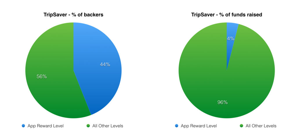
Here is a breakdown of Trip Saver’s backers by reward level and the percentage (%) of backers that each level represents.

  1. $1 – 681 backers – 44% of backers (Again, as designed, the lowest level, the app itself, offered at a 50% discount, had 44% of the backers, the most by far)
  2. $5 – 364 backers – 23%
  3. $14 – 323 backers – 21%
  4. $30 – 66 backers – 4%
  5. $50 – 62 backers – 4%
  6. $100 – 40 backers – 3%
  7. $250 – 2 backers – Less than 1%
  8. $500 – 2 backers – Less than 1%
  9. $2000 – 4 backers – Less than 1% (For this breakdown, I combined the three different $2,000 reward levels, which were essentially the same reward to different locations.)

And here is that same revenue breakdown by reward level and the percentage (%) of total funds raised.

  1. $1 level – $1,033 – 4% of funds raised
  2. $5 level – $2,035 – 7% of funds raised
  3. $14 – $5,339 – 19%
  4. $30 – $2,140 – 8%
  5. $50 – $3,335 – 12%
  6. $100 – $4,110 – 15%
  7. $250 – $500 – 2%
  8. $500 – $1,000 – 4%
  9. $2000 – $8,000 – 28%


TripSaver_Graph


Analysis and takeaways from TripSaver:

  • Again, notice that just the app level itself, even with more backers than any other level (44% of the total backers), only raised 4% of the funds, the third lowest level of funds raised!
  • The two slightly higher reward levels ($5 and $14 levels) contributed to 26% of the total funds raised.
  • Again, the lesson is clear. You need other, relevant and valuable perks at higher reward levels than the app itself.

Summary and Key Takeaways

  • Consumers already expect apps to be cheap (and they expect mobile apps to be cheaper than desktop apps)
  • You should price your app even cheaper than full (retail / app store) price when crowdfunding, because of fulfillment risk. A 50% discount is a good rule of thumb.
  • The app itself should be the first and lowest priced reward level.
  • However, this makes the per-unit price low, so you need to increase your average contribution per backer.
  • The easiest way to do this is to brainstorm and create other relevant and valuable perks and package them with the app at higher reward levels, while keeping each reward level “below MSRP”.
  • If these higher level rewards are digital (like Matt’s e-book guides), that makes fulfillment easier and decreases shipping time and cost.

If you liked this post…

While I love helping individual project creators like Matt and advising startups like Zive, there’s only one of me and I get too many inbound requests for crowdfunding help and consulting to handle them all.

So I’ve decided to take all of my expertise (from helping 80+ projects raise $20M+ total) and put it into an online crowdfunding course. There will be multiple instructional video modules, templates, a reward-level modeling spreadsheet and downloadable scripts and bonuses. If you’re on my email list, you’ll be the first to hear when I launch the course (soon!).

If you’re not on the list yet (or if you want to forward this to a friend), signup here.

When you sign up, you’ll also get three free bonuses instantly:

  1. My never before published crowdfunding presentation from Yanik Silver’s Underground conference
  2. An audio interview, where I shares my best crowdfunding tips and tricks with Dan Martell
  3. A bundle of my favorite crowdfunding tips, tricks and links

Thank you.

As always, thank you for reading. Time is the most valuable resource we all have and attention is the most valuable currency. I appreciate that you’ve given me both today. Thank you.

Kittyo_GA

How Kittyo Gathered 13,000 Opt-In Emails in Only 5 Months – Part 1 (Includes Successful Templates, Strategies, etc.)

UPDATE: Congratulations to Lee and the entire Kittyo team. They ended their stellar Kickstarter campaign on Friday, May 23rd, raising $271,154 from 2,425 backers.


NOTE: Before you read this post, please go back and read last week’s post, I explained exactly how Lee and the Kittyo team optimized their landing page until it eventually converted at 40-50%, well above the industry average.

The best way to build permission is to consistently deliver quality content, usually via a blog. But most crowdfunding creators haven’t done that. Many crowdfunding projects are brand new ideas. So a clear, effective landing page with an obvious value proposition is critical to building permission and trust (and collecting emails.)

A high-converting landing page is the key to your success. Sending traffic to a poorly converting landing page is like pouring water in a sieve. Once you have a landing page that converts well, you can turn on the traffic faucets using the strategies below, which sent people to the optimized landing page at Kittyo.com to collect their email and let them know when Kittyo launched on Kickstarter.

Again, if you haven’t read last week’s post, I encourage you to go back and review it before reading on.

How Kittyo Attracted 50,000 Targeted Visitors and Gathered Over 13,000 Emails in Only 5 Months

Once the landing page was optimized, it was time to send traffic to it. Below are the strategies that worked for Lee and the Kittyo team and can help you find and drive targeted traffic to your landing page and campaign.

Focus Like a Laser

Most people love to focus on the larger media outlets – there’s a thrill in seeing your name mentioned in a big name publication – but not all traffic is created equal.

A big part of Kittyo’s success is that they didn’t try to reach everyone but laser-focused specifically on the exact customers who would want to hear about their product. The big eyeballs and impressions offered by larger media outlets seem enticing, but they often send only “drive by traffic” that rarely results in actual customers, or even quality leads. More relevant sources will convert at a higher percentage, so if you want email opt-ins and backers, it pays to find highly targeted traffic.

Define Your Ideal Customer and Develop Your Customer Avatar

One of the best ways to make sure you’re focusing on targeted traffic is to develop a “customer avatar”, a detailed, hypothetical description of the ideal customer you want to reach. Broadly, Lee and the Kittyo team knew they were trying to reach “cat owners who owned smartphones”, a fairly broad demographic group.

More specifically, the ideal customer also worked outside the home, was an early adopter of technology, appreciated design and had at least moderate disposable income.

That’s enough detail to start developing their customer avatar.

The concept of developing a customer avatar is not new or particularly novel, but it’s often overlooked or poorly executed. If you Google “customer avatar”, you’ll find a lot of templates. The exact template doesn’t matter much. More important than the final document is the rigor used to think about specific details, needs and problems of your ideal customer. Etsy has a great blog post on how to define your ideal customer, so let’s use Etsy’s “ideal customer” template from that post (because Etsy is awesome.)

Kittyo’s Customer Avatar

If we were to use this template to define Kittyo’s customer avatar, it might look something like the following:

Kittyo_CustomerAvatar

Speak Like a Human

The specificity of your customer avatar is not meant to be limiting. It’s meant to help focus the messaging and keep it in a conversational, human voice.

When you talk to your best friend over dinner, you talk like a human.

When brands try to speak to everyone at once, they sound like, well, brands.

For the rest of your campaign, when you’re writing the project title, video script, reward level copy, campaign description, ads, etc., pretend you’re speaking to your friend Jessica over dinner. Your copy and messaging will be more human and conversational, which will not only convert better, it’s more fun to write.

What Sites Does Your Customer Read? Who Do They Trust?

OK. You’ve decided to laser focus your outreach, you’ve defined a detailed customer avatar and you have committed to communicate in a human voice. The next step is to find out where they hang out online. What sites does your customer read? What sites do they buy from? Who do they trust? Make a list.

Put yourself in their shoes. This is even easier if you are somewhat similar to your target customer.

Who do they follow on Twitter? What brands do they like on Facebook? Are they active Pinterest users, or do they stick to Instagram? What Google searches would they do?

Does this take time? Absolutely. But very soon, you are going to be asking people you have never met, who have never heard of you, to give money to you, an unproven stranger, to pre-buy a product that doesn’t even exist yet. 

So you owe it to your future customers to do the research to understand their needs and problems. Researching them takes time, but it’s well worth it.

Start With Google and Pinterest to Find the Ideal Sites & Blogs

This is where you get to play a little CSI without the blood or rubber gloves.Your job is to identify the sites and blogs your ideal customers knows, likes and trusts.

We know Jessica (our ideal customer avatar from above) loves her cat. We knows she reads Refinery29 (which has lots of well-designed products) and uses Pinterest. So Jessica may do a simple Pinterest search for “cat design” (possibly to find new cat products for her apartment.)

If we do a Pinterest search for those keywords, it turns up some interesting products but one source site in particular kept coming up…HausPanther.com. (see screenshot below – 3 products from hauspanther circled in red)

Kittyo_Pinterest_HousePanther

A quick review shows us that HausPanther is a site completely dedicated to Kittyo’s target market.

The tagline of the site is, “The premiere online magazine for design-conscious cat people.

On the site, there are high-end, designer cat products and even a “gear guide.”

Hauspanther is perfect and will convert to opt-ins much better than larger, more broadly targeted media outlets.


Kittyo_HausPanther

Find Similar Sites & Blogs

Once you find one “perfect” site (like HausPanther in this case), it’s actually easy to find similar sites.

Tools like, SimilarSiteSearch.comSimilarSites.com and SimilarWeb.com show you similar websites, including the types of visitors.

This step is so important, I’ll expand on it in an upcoming post but just by entering HausPanther.com into those sites, Lee can generate a long list of similar cat websites and blogs to reach out to.

SimilarSiteSearch_HausPanther

Work With Press and Bloggers to Add Value to Their Readers

Most creators approach press and bloggers in the wrong way. They assume it’s all about them and their project, when it’s really about adding value to the press outlet or blogger. Lee did his research and found out that HausPanther occasionally runs giveaway contests for their readers, so Lee worked with them. Over the course of five months, HausPanther covered Kittyo three different times.

  1. The first post in announced Kittyo and teased that there would be more to come and linked to Kittyo.com to allow readers to opt-in.
  2. The second post was one of HausPanther’s regular contest giveaways where readers could win a free Kittyo unit. Again, this adds value to both HausPanther’s readers and to Lee – when entering the contest, with a simple checkbox, readers could choose to opt-in to the Kittyo email list.
  3. The third post was announcing Kittyo’s Kickstarter launch on launch day.

Have a Clear, Compelling Value Proposition and a Great Headline

If you want to get covered by sites and blogs, they need a hook, an interesting reason to write about you. This hook is communicated via the headline, which often contains the key value proposition of your product.

Why is it new? Why is it interesting? Why should anyone care?

A great headline gets the reader intrigued enough that they want to read more.

Kittyo came up with the perfect headline that also communicated their value proposition. “Play with your cat. Even when you’re not home.”

KittyoHeadline

It’s the perfect headline. It speaks directly to cat owners. If playing with your cat when you’re not home is interesting to you, you’re intrigued enough to read more.

Engage On a Few Specific Social Media Platforms Well

In the next post, we’ll outline Lee and the Kittyo team’s social media strategy. We’ll show how they effectively leveraged a few specific social media platforms well, instead of spreading themselves too thin across too many platforms.

Any Questions?

As always, please leave any questions or comments below and I’ll try to answer as many as I can.

KittyoLandingPage_v3_FinalOptIn-623x1024

How to Build The Ultimate Landing Page (Before Your Launch Your Crowdfunding Campaign)

Last week, I explained how Kittyo’s success was perfectly planned and that the project was funded even before it launched.

It worked.

Kittyo’s $30,000 Kickstarter goal was fully funded (100%) in only 45 minutes. They were 200% funded in just a few hours and just passed $200,000 with 19 days to go.

Today, we’re going to analyze exactly how Kittyo used what I call, “The MacGyver Trick” to raise $200,000 in two weeks and crush their Kickstarter goal.

Remember MacGyver?

Growing up, I used to watch Monday Night Football on TV every week. But one hour before the real-life gladiators locked horns in a physical battle, I would watch a fictional character triumph in an intellectual one.

Every episode, the show’s main character MacGyver, played brilliantly by Richard Dean Anderson, found himself in a dire situation, often created by a recurring villain or that episode’s antagonist-of-the-week.

And every time, MacGyver solved complex problems and got himself out of these tough jams using everyday objects, like his trusty Swiss Army Knife, duct tape and whatever else he could find at his disposal.

So what does this have to do with crowdfunding?

In the show, MacGyver’s backstory was being a Bomb Team Technician in Vietnam.

In many episodes, the bad guys had set a bomb or explosive device that MacGyver had to disarm, often with only a few suspenseful seconds on the clock.

Tick, tock…

What if, instead of only a few seconds to defuse the bomb, MacGyver had hours?

Or days? Or even months?

For one, it would have killed the suspense and ruined the show, but on the other hand, MacGyver would have had more time to do it right.

Most creators launch their crowdfunding campaign and only THEN start marketing and promotion, putting themselves in a stressful MacGyver-like situation.

The difference between you and MacGyver? Instead of 10 seconds until the bomb goes off, you have 30 days until your campaign ends.

Tick, tock…

MacGyver only had a few seconds to cut the red wire or blue wire.

But he didn’t have a choice. You do.

You can plan ahead and give yourself more time before you launch your crowdfunding campaign.

How Kittyo used “The MacGyver Trick” to raise $200,000 in two weeks

When Lee first came to me in September, 2013, we had coffee and discussed his upcoming launch of Kittyo.

He had a great idea. He a had great product design. He had a very clear market (cat owners.)

The one thing he needed was permission to talk to those cat owners.

There are lots of ways to build permission and trust. If you’ve been writing a well-read blog for years or have a robust email list, you already have permission. But most crowdfunding creators don’t have that.

Building permission is the single most impactful thing you can do before any crowdfunding project. And if you haven’t built that permission already, a well-designed landing page is the best way to do it.

So to start, you need to build a clear, well-designed landing page that gives people the opportunity to opt-in.

And you need to start early. Your landing page should be live at least a month or two before your campaign launches and ideally even longer.

The reason Lee and the Kittyo team were fully funded in 45 minutes (and are at $200,000 in only two weeks) is that they started building permission six months before they launched and they designed a great landing page to build permission.

Build a great landing page

Instead of cramming all the marketing and promotion into the 30 days of the campaign, we wanted to do the opposite. We wanted to build a base of people that we had permission to notify when the campaign launched.

Our process:

  1. Plan: Start early (ideally, months before launch) and design a marketing and press plan.
  2. Build: Build a great landing page that explains the product and allows you to collect emails from interested people.
  3. Launch: Launch the landing page to the world.
  4. Promote: Send traffic to the landing page by promoting it in various ways and in various channels (more on this in the next two posts). Test what works and what doesn’t and repeat what works well.

Lee agreed to push off the campaign launch date by a few months to give us more time to plan.

The key elements of a great landing page

So next, we had to build a great landing page. The key elements of a great landing page are fairly simple:

  1. The Headline: A great landing page must have a simple, clear headline that not only grabs viewers’ interest, but tells them exactly what to expect. You have about 3 seconds (maybe less) to compel them to keep reading. Clarity is critical.
  2. Supporting detail: It’s important to have some supporting detail below the headline, but not too much. You want the reader to finish reading and move on to…
  3. The Call-To-Action: A singular, call to action (email opt-in) as the primary design element on the page, above the fold.
  4. The Promise: A compelling promise or a reason to sign up (now, not later). Explain exactly what benefit the user gets by giving you their email.
  5. Design and Branding: Plain, text-heavy landing pages are boring. A great picture really is worth a thousand words. If you have a compelling video, even better. Colors, typography and consistently branded design elements are critical. Great design imbues trust and quality beyond the design itself.

Getting started is half done

You can’t optimize what isn’t built yet, so the first step is to build the landing page with the key components above.

It’s fine if it’s less than perfect. In fact, it should be. As French philosopher, writer and landing page designer Voltaire taught us, “the best is the enemy of the good”.

The important part is that it’s done.

Then you can start optimizing.

Kittyo Landing Page – Version 1:

The first version of the landing page Lee created was beautifully designed but had some issues, so the next step was to optimize the landing page.

Below is Lee’s first landing page, before optimization.

Let’s call this Version 1.

Note: These versions of Kittyo’s landing page were never previously published, but I promised to take you all “behind-the-scenes”, and Lee graciously agreed to let me show you everything to better demonstrate the process.

(You can click on any of the landing page images to view a larger version.)


KittyoLandingPage_v1

Analysis of Version 1:

Now, let’s review it, using our simple 5-step landing page formula:

  1. The Headline: This “When you’re away…the cat will play.” headline is a clever riff on a well known phrase but it doesn’t explain the core benefit to the user in a compelling way, which is the main job of the headline.
  2. Supporting detail: In this version, there was still some lorem ipsum placeholder copy but there were a couple too many cat puns.
  3. The Call-To-Action: Initially, the opt-in box was too far down the page. Users had to scroll to the bottom of the page before they even had the chance to opt-in.
  4. The Promise: It’s not terrible but the “stay updated with our progress” doesn’t offer any additional benefit or incentive to signup.
  5. Design and Branding: This part was perfect. The Kittyo team has great design and branding, including crisp photography (both of the cats and of the product itself), great consistent colors and beautiful, clean typography. At this point, the Kittyo team didn’t have a shot of the product to add, but that would come in V2.


Kittyo Landing Page – Version 2:

After some recommendations, Lee’s team revised the landing page and version 2 was much better.


KittyoLandingPage_v2

Analysis of Version 2:

Again, let’s review it, using our simple 5-step landing page formula:

  1. The Headline: The new main headline “Instant CATification” was still too much ‘cat pun’, but the sub-headline was improving and framing the specific user benefit much better.
  2. Supporting detail: In this version, the icons + bulleted features and benefits were clear and compelling.
  3. The Call-To-Action: Again, the main opt-in box is too far down at the bottom of the page. Another one was added in the header but neither were optimally placed, above the fold in the main part of the page as the primary call-to-action.
  4. The Promise: This promise is much better. It clearly explains that “Kittyo is currently in development and will be available for pre-order in early 2014. Simply sign up below (or on top of page), and we’ll keep you posted.” That’s a lot of good, specific information. The only thing missing is a more compelling reason for users to sign-up.
  5. Design and Branding: Again, the design and branding were stellar. This version included the new product shot with the laser and the photo of the cat.


Kittyo Landing Page – Version 3: “Ship it.”

In the final version Lee’s team executed in a big way and delivered one of the single best landing pages I’ve ever seen for any product or service.

Here is the final version (this version was live up until the Kickstarter launch on April 21st):


KittyoLandingPage_v3_FinalOptIn

 Analysis of Version 3:

Again, let’s review the final version, using our simple 5-step landing page formula:

  1. The Headline: The new main headline is perfect. “Play With Your Cat. Even When You’re Not Home.” is clear and compelling. It describes the exact benefit to the user in simple, straightforward, human language.
  2. Supporting detail: The sub-headline was much improved and the icons + bulleted features and benefits helped support the value proposition.
  3. The Call-To-Action: The call-to-action was perfectly placed in the middle of the page, below the headline + sub-headline and right next to the large product “hero” image.
  4. The Promise: This promise is perfect. It not only explains that Kittyo is currently in development and will be launching soon on Kickstarter, but it also adds a compelling reason for users to sign-up, “Sign up below to find out when you can get Kittyo at a special discounted price.” This wasn’t just a gimmick, the early backers that opted-in to the page did get Kittyo at the cheapest “super early bird” $99 price, a level which sold out all 1,000 units quickly.
  5. Design and Branding: The design is basically perfect. Clean colors, consistent branding and ideal typography wrap around a huge, clear hero image of the product and a perfectly placed opt-in box.

So did it work?

In a word, absolutely.

The quality was proven out when the landing page converted traffic to email opt-ins at between 40-50%, depending on traffic source. (That means 40-50% of the visitors to page entered their email to receive updates.)

40-50% is well above the industry average.

Kudos to Lee and the Kittyo team for executing on the strategy and building an A+ landing page.

Summary

Launching your crowdfunding campaign and then starting the marketing and promotion is putting yourself in a MacGyver-like crisis situation.

Instead, start months ahead of time and build the perfect landing page to communicate your project to the right groups. Collect emails to gain permission to let them know when you launch. Offer a compelling reason for them to opt-in, like an early bird discount.

Next week: How Kittyo drove loads of traffic to their landing page

In next week’s post, we’ll explain exactly how Lee and the Kittyo team sent a TON of qualified traffic (not just any traffic but highly targeted cat-lovers) to their landing page, which resulted in collected over 13,000 emails in the months leading up to their Kickstarter launch.


Fun MacGyver extras

Fun, random facts and links about MacGyver (from Wikipedia and YouTube):

  1. The character’s full name was “Angus MacGyver”, although his first name is rarely uttered in the show.
  2. Henry Winkler (aka, “The Fonz”) was an executive producer of MacGyver, having just finished his run on Happy Days and looking for a new project.
  3. On the show, Richard Dean Anderson would almost always do his own stunts, though in later seasons he reduced his participation because of accumulating injuries.
  4. In 2006, Richard Dean Anderson appeared in a Super Bowl commercial for MasterCard. You can watch the full commercial, including a making-of interview here on YouTube.
  5. Want to see a classic MacGyver clip where he disarms a bomb with a paper clip? Enjoy. (It’s the clip where the image above came from.)


Photo credit: CBS Entertainment

KittyoHeroHighRes

This Kickstarter Project is Already Funded (and it Hasn’t Even Launched Yet)

[UPDATE: We were right. Lee’s Kittyo Kickstarter campaign is already fully funded! He raised $30,000 in less than an hour! And the funds raised total is still rising rapidly. Huge congratulations to Lee and the entire Kittyo team!]

Last September, Lee Miller came to me for crowdfunding advice.  We met for coffee to discuss his unique idea for a device that would allow you to play with your cat, even when you’re not home.

Now, seven months later, Lee Miller’s Kittyo project is launching (in just a few minutes) on Kickstarter.

Most project creators get very nervous about finally publishing their project and baring their idea to the world.

But Lee doesn’t need to get nervous.

He doesn’t need to worry at all.

Because Lee’s project is already funded.

Not because he has a rich uncle or outside investor money. I mean “Kickstarter-funded”, from backers that want his product.

My guess is, he’ll get fully funded in a few hours and by the end of the campaign, hit a multiple of his $30,000 funding goal.

So how did Lee do it?

Lee’s imminent Kickstarter success wasn’t the result of one “silver-bullet” trick or tactic (although there were a few key ones he executed on brilliantly.)

It was the result of months of planning and smart execution of a robust marketing plan.

  1. He invented a new and novel product idea that people actually wanted.
  2. He partnered with an amazing design team to bring his idea to life.
  3. He found the tribes and sub-tribes of people who desperately cared (and he ignored everyone else).
  4. He used clear design, copy and calls-to-action in all of his marketing and messaging.
  5. He designed a perfect Kickstarter project page, from a great video to compelling reward level pricing and copy to high resolution product images.
  6. He built and optimized a perfect landing page that explained the product, the benefits and the offer. (It worked so well, it converted at more than 40%.)
  7. He used that landing page to get permission to announce his launch to over 13,000 cat lovers that opted in to be notified of the launch.


Want to go behind the scenes of Kittyo’s success?

Lee and I are working closely together and over the next 32 days, I want to bring you behind the scenes of Kittyo, sharing the exact tips, tricks and marketing strategies that are going to make Kittyo such a smash success.

  • I’ll share how Lee is maximizing the press story and the impact of that story.
  • I’ll share how he’s getting his backers to share the project with their friends.
  • I’ll share exactly how Lee is planning and creating his project updates to keep backers interested.
  • And much, much more…

I look forward to sharing Lee’s and Kittyo’s success with you.