Kittyo_GA

How Kittyo Gathered 13,000 Opt-In Emails in Only 5 Months – Part 1 (Includes Successful Templates, Strategies, etc.)

UPDATE: Congratulations to Lee and the entire Kittyo team. They ended their stellar Kickstarter campaign on Friday, May 23rd, raising $271,154 from 2,425 backers.


NOTE: Before you read this post, please go back and read last week’s post, I explained exactly how Lee and the Kittyo team optimized their landing page until it eventually converted at 40-50%, well above the industry average.

The best way to build permission is to consistently deliver quality content, usually via a blog. But most crowdfunding creators haven’t done that. Many crowdfunding projects are brand new ideas. So a clear, effective landing page with an obvious value proposition is critical to building permission and trust (and collecting emails.)

A high-converting landing page is the key to your success. Sending traffic to a poorly converting landing page is like pouring water in a sieve. Once you have a landing page that converts well, you can turn on the traffic faucets using the strategies below, which sent people to the optimized landing page at Kittyo.com to collect their email and let them know when Kittyo launched on Kickstarter.

Again, if you haven’t read last week’s post, I encourage you to go back and review it before reading on.

How Kittyo Attracted 50,000 Targeted Visitors and Gathered Over 13,000 Emails in Only 5 Months

Once the landing page was optimized, it was time to send traffic to it. Below are the strategies that worked for Lee and the Kittyo team and can help you find and drive targeted traffic to your landing page and campaign.

Focus Like a Laser

Most people love to focus on the larger media outlets – there’s a thrill in seeing your name mentioned in a big name publication – but not all traffic is created equal.

A big part of Kittyo’s success is that they didn’t try to reach everyone but laser-focused specifically on the exact customers who would want to hear about their product. The big eyeballs and impressions offered by larger media outlets seem enticing, but they often send only “drive by traffic” that rarely results in actual customers, or even quality leads. More relevant sources will convert at a higher percentage, so if you want email opt-ins and backers, it pays to find highly targeted traffic.

Define Your Ideal Customer and Develop Your Customer Avatar

One of the best ways to make sure you’re focusing on targeted traffic is to develop a “customer avatar”, a detailed, hypothetical description of the ideal customer you want to reach. Broadly, Lee and the Kittyo team knew they were trying to reach “cat owners who owned smartphones”, a fairly broad demographic group.

More specifically, the ideal customer also worked outside the home, was an early adopter of technology, appreciated design and had at least moderate disposable income.

That’s enough detail to start developing their customer avatar.

The concept of developing a customer avatar is not new or particularly novel, but it’s often overlooked or poorly executed. If you Google “customer avatar”, you’ll find a lot of templates. The exact template doesn’t matter much. More important than the final document is the rigor used to think about specific details, needs and problems of your ideal customer. Etsy has a great blog post on how to define your ideal customer, so let’s use Etsy’s “ideal customer” template from that post (because Etsy is awesome.)

Kittyo’s Customer Avatar

If we were to use this template to define Kittyo’s customer avatar, it might look something like the following:

Kittyo_CustomerAvatar

Speak Like a Human

The specificity of your customer avatar is not meant to be limiting. It’s meant to help focus the messaging and keep it in a conversational, human voice.

When you talk to your best friend over dinner, you talk like a human.

When brands try to speak to everyone at once, they sound like, well, brands.

For the rest of your campaign, when you’re writing the project title, video script, reward level copy, campaign description, ads, etc., pretend you’re speaking to your friend Jessica over dinner. Your copy and messaging will be more human and conversational, which will not only convert better, it’s more fun to write.

What Sites Does Your Customer Read? Who Do They Trust?

OK. You’ve decided to laser focus your outreach, you’ve defined a detailed customer avatar and you have committed to communicate in a human voice. The next step is to find out where they hang out online. What sites does your customer read? What sites do they buy from? Who do they trust? Make a list.

Put yourself in their shoes. This is even easier if you are somewhat similar to your target customer.

Who do they follow on Twitter? What brands do they like on Facebook? Are they active Pinterest users, or do they stick to Instagram? What Google searches would they do?

Does this take time? Absolutely. But very soon, you are going to be asking people you have never met, who have never heard of you, to give money to you, an unproven stranger, to pre-buy a product that doesn’t even exist yet. 

So you owe it to your future customers to do the research to understand their needs and problems. Researching them takes time, but it’s well worth it.

Start With Google and Pinterest to Find the Ideal Sites & Blogs

This is where you get to play a little CSI without the blood or rubber gloves.Your job is to identify the sites and blogs your ideal customers knows, likes and trusts.

We know Jessica (our ideal customer avatar from above) loves her cat. We knows she reads Refinery29 (which has lots of well-designed products) and uses Pinterest. So Jessica may do a simple Pinterest search for “cat design” (possibly to find new cat products for her apartment.)

If we do a Pinterest search for those keywords, it turns up some interesting products but one source site in particular kept coming up…HausPanther.com. (see screenshot below – 3 products from hauspanther circled in red)

Kittyo_Pinterest_HousePanther

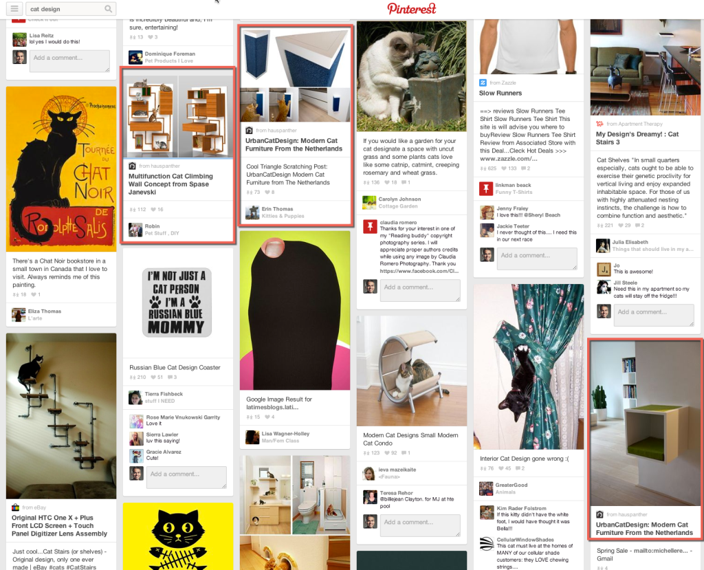
A quick review shows us that HausPanther is a site completely dedicated to Kittyo’s target market.

The tagline of the site is, “The premiere online magazine for design-conscious cat people.

On the site, there are high-end, designer cat products and even a “gear guide.”

Hauspanther is perfect and will convert to opt-ins much better than larger, more broadly targeted media outlets.


Kittyo_HausPanther

Find Similar Sites & Blogs

Once you find one “perfect” site (like HausPanther in this case), it’s actually easy to find similar sites.

Tools like, SimilarSiteSearch.comSimilarSites.com and SimilarWeb.com show you similar websites, including the types of visitors.

This step is so important, I’ll expand on it in an upcoming post but just by entering HausPanther.com into those sites, Lee can generate a long list of similar cat websites and blogs to reach out to.

SimilarSiteSearch_HausPanther

Work With Press and Bloggers to Add Value to Their Readers

Most creators approach press and bloggers in the wrong way. They assume it’s all about them and their project, when it’s really about adding value to the press outlet or blogger. Lee did his research and found out that HausPanther occasionally runs giveaway contests for their readers, so Lee worked with them. Over the course of five months, HausPanther covered Kittyo three different times.

  1. The first post in announced Kittyo and teased that there would be more to come and linked to Kittyo.com to allow readers to opt-in.
  2. The second post was one of HausPanther’s regular contest giveaways where readers could win a free Kittyo unit. Again, this adds value to both HausPanther’s readers and to Lee – when entering the contest, with a simple checkbox, readers could choose to opt-in to the Kittyo email list.
  3. The third post was announcing Kittyo’s Kickstarter launch on launch day.

Have a Clear, Compelling Value Proposition and a Great Headline

If you want to get covered by sites and blogs, they need a hook, an interesting reason to write about you. This hook is communicated via the headline, which often contains the key value proposition of your product.

Why is it new? Why is it interesting? Why should anyone care?

A great headline gets the reader intrigued enough that they want to read more.

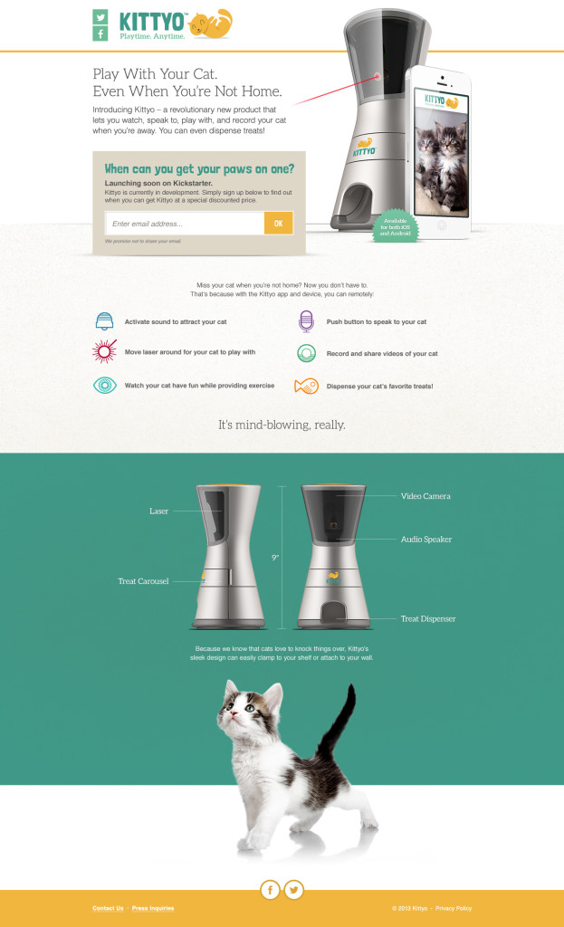
Kittyo came up with the perfect headline that also communicated their value proposition. “Play with your cat. Even when you’re not home.”

KittyoHeadline

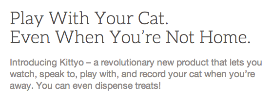
It’s the perfect headline. It speaks directly to cat owners. If playing with your cat when you’re not home is interesting to you, you’re intrigued enough to read more.

Engage On a Few Specific Social Media Platforms Well

In the next post, we’ll outline Lee and the Kittyo team’s social media strategy. We’ll show how they effectively leveraged a few specific social media platforms well, instead of spreading themselves too thin across too many platforms.

Any Questions?

As always, please leave any questions or comments below and I’ll try to answer as many as I can.

KittyoLandingPage_v3_FinalOptIn-623x1024

How to Build The Ultimate Landing Page (Before Your Launch Your Crowdfunding Campaign)

Last week, I explained how Kittyo’s success was perfectly planned and that the project was funded even before it launched.

It worked.

Kittyo’s $30,000 Kickstarter goal was fully funded (100%) in only 45 minutes. They were 200% funded in just a few hours and just passed $200,000 with 19 days to go.

Today, we’re going to analyze exactly how Kittyo used what I call, “The MacGyver Trick” to raise $200,000 in two weeks and crush their Kickstarter goal.

Remember MacGyver?

Growing up, I used to watch Monday Night Football on TV every week. But one hour before the real-life gladiators locked horns in a physical battle, I would watch a fictional character triumph in an intellectual one.

Every episode, the show’s main character MacGyver, played brilliantly by Richard Dean Anderson, found himself in a dire situation, often created by a recurring villain or that episode’s antagonist-of-the-week.

And every time, MacGyver solved complex problems and got himself out of these tough jams using everyday objects, like his trusty Swiss Army Knife, duct tape and whatever else he could find at his disposal.

So what does this have to do with crowdfunding?

In the show, MacGyver’s backstory was being a Bomb Team Technician in Vietnam.

In many episodes, the bad guys had set a bomb or explosive device that MacGyver had to disarm, often with only a few suspenseful seconds on the clock.

Tick, tock…

What if, instead of only a few seconds to defuse the bomb, MacGyver had hours?

Or days? Or even months?

For one, it would have killed the suspense and ruined the show, but on the other hand, MacGyver would have had more time to do it right.

Most creators launch their crowdfunding campaign and only THEN start marketing and promotion, putting themselves in a stressful MacGyver-like situation.

The difference between you and MacGyver? Instead of 10 seconds until the bomb goes off, you have 30 days until your campaign ends.

Tick, tock…

MacGyver only had a few seconds to cut the red wire or blue wire.

But he didn’t have a choice. You do.

You can plan ahead and give yourself more time before you launch your crowdfunding campaign.

How Kittyo used “The MacGyver Trick” to raise $200,000 in two weeks

When Lee first came to me in September, 2013, we had coffee and discussed his upcoming launch of Kittyo.

He had a great idea. He a had great product design. He had a very clear market (cat owners.)

The one thing he needed was permission to talk to those cat owners.

There are lots of ways to build permission and trust. If you’ve been writing a well-read blog for years or have a robust email list, you already have permission. But most crowdfunding creators don’t have that.

Building permission is the single most impactful thing you can do before any crowdfunding project. And if you haven’t built that permission already, a well-designed landing page is the best way to do it.

So to start, you need to build a clear, well-designed landing page that gives people the opportunity to opt-in.

And you need to start early. Your landing page should be live at least a month or two before your campaign launches and ideally even longer.

The reason Lee and the Kittyo team were fully funded in 45 minutes (and are at $200,000 in only two weeks) is that they started building permission six months before they launched and they designed a great landing page to build permission.

Build a great landing page

Instead of cramming all the marketing and promotion into the 30 days of the campaign, we wanted to do the opposite. We wanted to build a base of people that we had permission to notify when the campaign launched.

Our process:

  1. Plan: Start early (ideally, months before launch) and design a marketing and press plan.
  2. Build: Build a great landing page that explains the product and allows you to collect emails from interested people.
  3. Launch: Launch the landing page to the world.
  4. Promote: Send traffic to the landing page by promoting it in various ways and in various channels (more on this in the next two posts). Test what works and what doesn’t and repeat what works well.

Lee agreed to push off the campaign launch date by a few months to give us more time to plan.

The key elements of a great landing page

So next, we had to build a great landing page. The key elements of a great landing page are fairly simple:

  1. The Headline: A great landing page must have a simple, clear headline that not only grabs viewers’ interest, but tells them exactly what to expect. You have about 3 seconds (maybe less) to compel them to keep reading. Clarity is critical.
  2. Supporting detail: It’s important to have some supporting detail below the headline, but not too much. You want the reader to finish reading and move on to…
  3. The Call-To-Action: A singular, call to action (email opt-in) as the primary design element on the page, above the fold.
  4. The Promise: A compelling promise or a reason to sign up (now, not later). Explain exactly what benefit the user gets by giving you their email.
  5. Design and Branding: Plain, text-heavy landing pages are boring. A great picture really is worth a thousand words. If you have a compelling video, even better. Colors, typography and consistently branded design elements are critical. Great design imbues trust and quality beyond the design itself.

Getting started is half done

You can’t optimize what isn’t built yet, so the first step is to build the landing page with the key components above.

It’s fine if it’s less than perfect. In fact, it should be. As French philosopher, writer and landing page designer Voltaire taught us, “the best is the enemy of the good”.

The important part is that it’s done.

Then you can start optimizing.

Kittyo Landing Page – Version 1:

The first version of the landing page Lee created was beautifully designed but had some issues, so the next step was to optimize the landing page.

Below is Lee’s first landing page, before optimization.

Let’s call this Version 1.

Note: These versions of Kittyo’s landing page were never previously published, but I promised to take you all “behind-the-scenes”, and Lee graciously agreed to let me show you everything to better demonstrate the process.

(You can click on any of the landing page images to view a larger version.)


KittyoLandingPage_v1

Analysis of Version 1:

Now, let’s review it, using our simple 5-step landing page formula:

  1. The Headline: This “When you’re away…the cat will play.” headline is a clever riff on a well known phrase but it doesn’t explain the core benefit to the user in a compelling way, which is the main job of the headline.
  2. Supporting detail: In this version, there was still some lorem ipsum placeholder copy but there were a couple too many cat puns.
  3. The Call-To-Action: Initially, the opt-in box was too far down the page. Users had to scroll to the bottom of the page before they even had the chance to opt-in.
  4. The Promise: It’s not terrible but the “stay updated with our progress” doesn’t offer any additional benefit or incentive to signup.
  5. Design and Branding: This part was perfect. The Kittyo team has great design and branding, including crisp photography (both of the cats and of the product itself), great consistent colors and beautiful, clean typography. At this point, the Kittyo team didn’t have a shot of the product to add, but that would come in V2.


Kittyo Landing Page – Version 2:

After some recommendations, Lee’s team revised the landing page and version 2 was much better.


KittyoLandingPage_v2

Analysis of Version 2:

Again, let’s review it, using our simple 5-step landing page formula:

  1. The Headline: The new main headline “Instant CATification” was still too much ‘cat pun’, but the sub-headline was improving and framing the specific user benefit much better.
  2. Supporting detail: In this version, the icons + bulleted features and benefits were clear and compelling.
  3. The Call-To-Action: Again, the main opt-in box is too far down at the bottom of the page. Another one was added in the header but neither were optimally placed, above the fold in the main part of the page as the primary call-to-action.
  4. The Promise: This promise is much better. It clearly explains that “Kittyo is currently in development and will be available for pre-order in early 2014. Simply sign up below (or on top of page), and we’ll keep you posted.” That’s a lot of good, specific information. The only thing missing is a more compelling reason for users to sign-up.
  5. Design and Branding: Again, the design and branding were stellar. This version included the new product shot with the laser and the photo of the cat.


Kittyo Landing Page – Version 3: “Ship it.”

In the final version Lee’s team executed in a big way and delivered one of the single best landing pages I’ve ever seen for any product or service.

Here is the final version (this version was live up until the Kickstarter launch on April 21st):


KittyoLandingPage_v3_FinalOptIn

 Analysis of Version 3:

Again, let’s review the final version, using our simple 5-step landing page formula:

  1. The Headline: The new main headline is perfect. “Play With Your Cat. Even When You’re Not Home.” is clear and compelling. It describes the exact benefit to the user in simple, straightforward, human language.
  2. Supporting detail: The sub-headline was much improved and the icons + bulleted features and benefits helped support the value proposition.
  3. The Call-To-Action: The call-to-action was perfectly placed in the middle of the page, below the headline + sub-headline and right next to the large product “hero” image.
  4. The Promise: This promise is perfect. It not only explains that Kittyo is currently in development and will be launching soon on Kickstarter, but it also adds a compelling reason for users to sign-up, “Sign up below to find out when you can get Kittyo at a special discounted price.” This wasn’t just a gimmick, the early backers that opted-in to the page did get Kittyo at the cheapest “super early bird” $99 price, a level which sold out all 1,000 units quickly.
  5. Design and Branding: The design is basically perfect. Clean colors, consistent branding and ideal typography wrap around a huge, clear hero image of the product and a perfectly placed opt-in box.

So did it work?

In a word, absolutely.

The quality was proven out when the landing page converted traffic to email opt-ins at between 40-50%, depending on traffic source. (That means 40-50% of the visitors to page entered their email to receive updates.)

40-50% is well above the industry average.

Kudos to Lee and the Kittyo team for executing on the strategy and building an A+ landing page.

Summary

Launching your crowdfunding campaign and then starting the marketing and promotion is putting yourself in a MacGyver-like crisis situation.

Instead, start months ahead of time and build the perfect landing page to communicate your project to the right groups. Collect emails to gain permission to let them know when you launch. Offer a compelling reason for them to opt-in, like an early bird discount.

Next week: How Kittyo drove loads of traffic to their landing page

In next week’s post, we’ll explain exactly how Lee and the Kittyo team sent a TON of qualified traffic (not just any traffic but highly targeted cat-lovers) to their landing page, which resulted in collected over 13,000 emails in the months leading up to their Kickstarter launch.


Fun MacGyver extras

Fun, random facts and links about MacGyver (from Wikipedia and YouTube):

  1. The character’s full name was “Angus MacGyver”, although his first name is rarely uttered in the show.
  2. Henry Winkler (aka, “The Fonz”) was an executive producer of MacGyver, having just finished his run on Happy Days and looking for a new project.
  3. On the show, Richard Dean Anderson would almost always do his own stunts, though in later seasons he reduced his participation because of accumulating injuries.
  4. In 2006, Richard Dean Anderson appeared in a Super Bowl commercial for MasterCard. You can watch the full commercial, including a making-of interview here on YouTube.
  5. Want to see a classic MacGyver clip where he disarms a bomb with a paper clip? Enjoy. (It’s the clip where the image above came from.)


Photo credit: CBS Entertainment